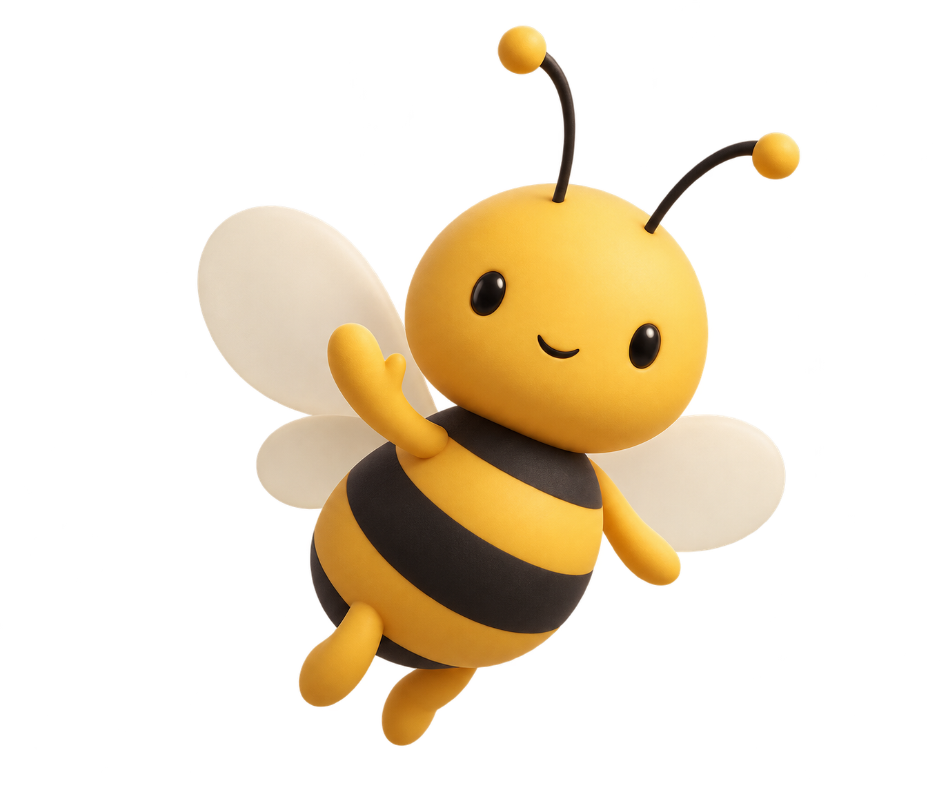
A little bee.
A bigger presence.
Honey yellow. Confident ink. Room to breathe.
A proposed identity for a brand made to be seen.
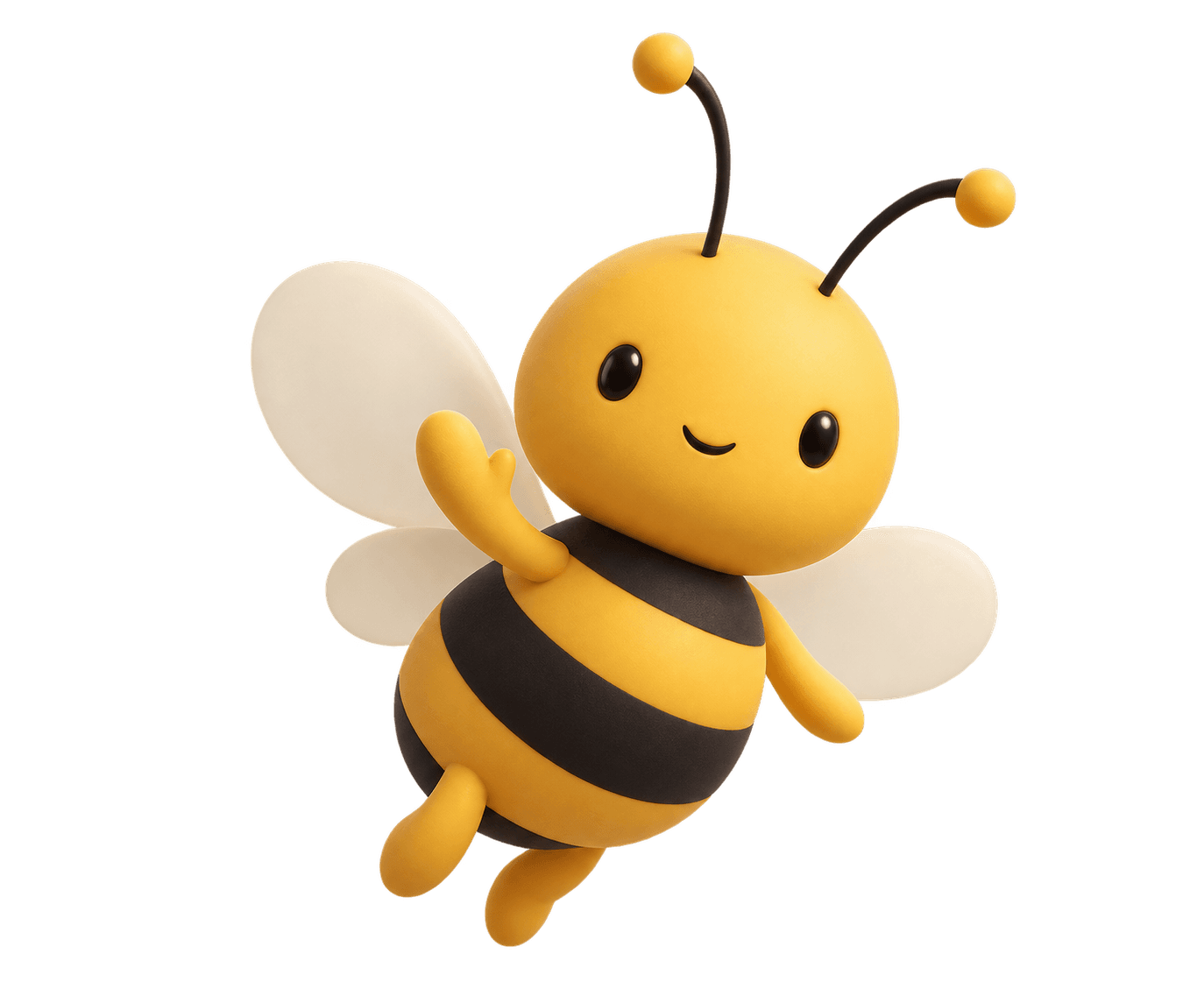 A FRIENDLY FACE / THE MASCOT
Warm. Clear. Recognisable.
Use ink on yellow for readable contrast. Give yellow a purpose: an action, a highlight, a moment of personality.
Instrument Sans.
Open, modern, and quietly distinctive. Regular and medium weights for headlines and body copy. JetBrains Mono for numbers.
Real places. Measurable attention.
01 / 26,813 / 2.7sOne mark.
A consistent character.
Give the bee some air.
Keep at least one wing width of clear space around the mark. Use the simple symbol at small sizes, with a minimum width of 24px.
Keep the mascot for human moments.
Use the character for welcome messages, campaign celebrations and interactive experiences. Keep the navigation and reporting focused on the geometric mark.
Keep the story honest.
Installation images are AI-generated concepts. Label them clearly until actual venue photography is available.
Ready to make an impression.
Editable SVG marks, a transparent PNG mascot, and reusable colour tokens. Wordmarks use live text; install Instrument Sans for the intended appearance.